Ever walked into a room and instantly felt tense, without knowing why?
The lights are too bright. The colors are too loud. The vibes are off. It's just too much.

If you're autistic, you might process sensory information such as colors and lighting in your surroundings differently than others. You can experience both hypersensitivity (over-responsiveness) and hyposensitivity (under-responsiveness) to certain senses.
Sensory Processing in Autism

Many autistic people are "visual thinkers", which means you might process information better through images, shapes, symbols, diagrams, and colors.
This visual preference makes color a powerful tool for expressing your emotions. It also helps you maintain focus and a sense of control over your space.
 Whether you're...
renovating your dream bedroom
adjusting your work-from-home setup
decorating your workspace
moving into a new home
creating a piece of artwork
...following these steps can help you find colors that manage your autism, reduce stress and sensory overload, and help you feel more at ease in your space.
1. Know Your Sensory Reaction to Color
Everyone reacts to color differently, but for autistic people, those reactions can be way more intense. You may notice that:
 Photo by Jenn on Unsplash
Bright reds or neon lights can feel "too loud" and trigger anxiety or a sense of danger.
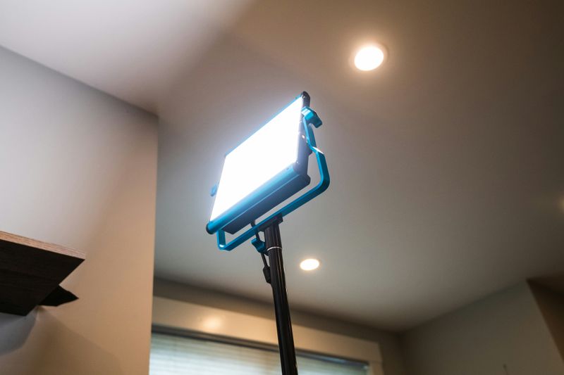 Photo by FilterGrade on Unsplash
Harsh white or fluorescent lighting can cause headaches.
Some autistic people prefer bold or bright colors (sensory-seeking). Others feel better with soft tones (sensory-avoidant). You may process sensory input more deeply, meaning that color isn't a background detail but a whole experience.
 Practical Tools
Try using a color picker tool like Color Hunt or Coolers to explore your reactions to colors. Save or take screenshots of color combos that you like and don't like.
Use "Dark Mode" or night mode filters on your phone or laptop to test how certain color tints affect your screen comfort.
2. Find Your Personal Autism Color Palette
Now that you're paying attention to how you react to color, it’s time to find your unique mix of colors that help you feel calm, safe, or energized — in a good way!
Here's where developing your own personal autism color palette comes in.
Color palettes are visual tools that help autistic people connect their emotions to colors. You can customise it to show which shades make you feel:
safe and calm
overstimulated
focused or happy
Here are a few popular comfort colors shared by autistic people:
 Photo by Andrew Small on Unsplash
Sage green feels organic and relaxing, like you're in nature.
 Photo by Ben Griffiths on Unsplash
Cream and beige are warm neutral tones that help limit distractions and redirect focus.
 Photo by Yuriy Kovalev on Unsplash
Soft blue is gentle and peaceful, like calm water.
 Photo by Angelo Casto on Unsplash
Pastel pink or purple feels safe and comfortable, due to their lower saturation and lighter tones.
 Color theory backs this up:
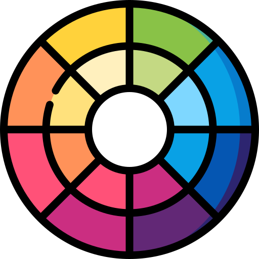
Cool tones like blue and green tend to calm the nervous system. They can also call for feelings of sadness or loneliness (particularly the darker shades).
Warm tones like red, orange and yellow, tend to stimulate the nervous system and evoke feelings of warmth, safety and comfort. They can also call for feelings of anger or urgency (particularly the brighter shades).
The key is to find a balance that suits you and your needs!
Quiz
Which of the following is the best strategy to help you discover your personal autism color palette?
3. Use Colors to Make a Positive Change to Your Life

Now that you know what colors help manage your autism, you can bring them into your:
Bedroom: Paint walls, use comfort-colored bedding or curtains.
Workspace: Add a colored lamp, notebook, or screen tint.
Phone/computer: Switch to calming wallpapers, enable dark mode, use a blue light filter.
Chill-out zones: Use soft colors and lighting to create a relaxing space.
Artwork or creative projects: Use a color palette that represents who you are.
 Try this:
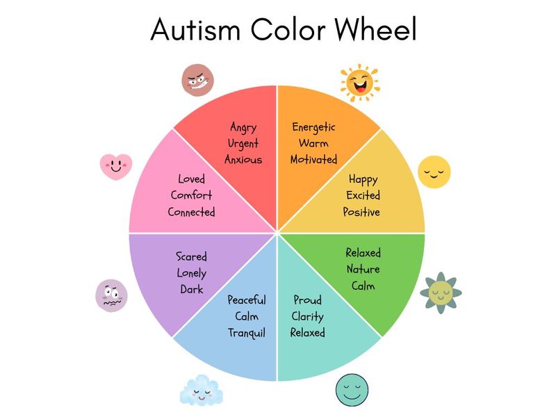
Create your own autism color wheel (see example below). Label sections based on how each color makes you feel.
 Look at your bedroom or workspace. What’s one item you could swap for something in your comfort color — a throw pillow, light bulb, mousepad, or even your phone wallpaper?
4. Advocate for Your Sensory Needs

When your sensory environment affects your comfort and well-being, know that you can advocate for your needs.
You can use these strategies in personal, work, or school settings:

Communicate your needs clearly.
Explain how certain colors affect your mood, focus, or senses.
"Bright lights and red walls make it hard for me to concentrate."
"I've found that soft greens and blues help me focus and feel less overwhelmed. I'd like to decorate my workspace with these colors."
“I focus better in lower lighting. Would it be okay if I used a desk lamp instead of overheads?”

Prepare visual or written aids.
Sometimes showing is easier than telling.
Bring screenshots of your preferred aesthetic.
Share mood boards or color palettes with people you know.
Autism colors aren’t a one-size-fits-all, they’re about creating a space that feels good and comfortable for you.
Quick quiz: How would you advocate for yourself?
 Photo by Christin Hume on Unsplash
Imagine you're in a classroom or workspace with bright red walls and fluorescent lighting. It's making you feel anxious and unfocused. What could you say to advocate for your sensory needs?
Choose the best response:
A. "I’ve been finding it a bit hard to focus lately. The lights and colours in this room might be part of it."
B. "Would it be okay if I changed a few things around my space? I work better with softer lighting and cooler colours."
C. "I really don’t like how this room looks. It’s kind of distracting."
Quiz
Which response is the best?
Take Action
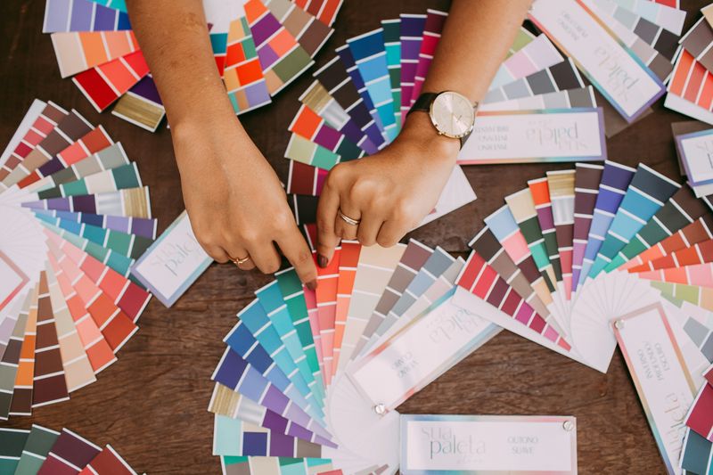 Photo by Helena Lopes on Unsplash
Build your autism colors toolkit:
Your feedback matters to us.
This Byte helped me better understand the topic.
